What We Found
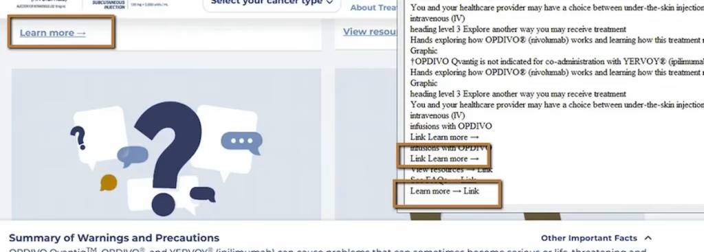
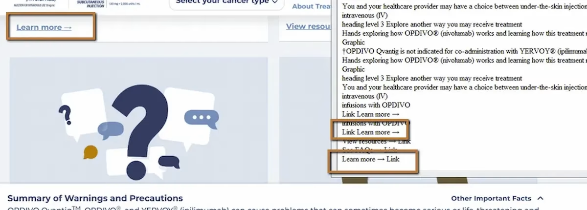
During a recent audit, we tested a page using NVDA (a screen reader) on Chrome. The page had multiple content sections, each with its own “Learn More” link at the bottom. Visually, the layout made it clear what each link related to. The link under the treatment section pointed to treatment info. The link under safety pointed to safety details. The visual grouping did the work.
Then we pulled up the Links List, which is a feature screen reader users rely on to see every link on a page at once. Here’s what it showed:
“Learn More.”“Learn More.”“Learn More.”“Learn More.”
Every link announced identically. No way to tell which one goes where.
WCAG 2.4.4: Link Purpose – In Context (Severity: High)
How Screen Reader Users Actually Navigate Links
This is one of those barriers that’s hard to appreciate until you understand the workflow it breaks. Screen reader users don’t always read a page top to bottom. One of the most common navigation shortcuts is pulling up a list of all links on the page and scanning that list to find what they need. It’s fast and efficient, similar to how a sighted user might visually scan a page for clickable text.
But this only works when link text is descriptive. When every link says “Learn More,” the list becomes useless. The user can’t distinguish between treatment information, side effects, patient support, or anything else. They’re left clicking links one by one, waiting for each page to load, and backing out if it’s not what they were looking for. Navigation becomes trial and error.
The other common approach is pressing a shortcut key to jump from link to link sequentially. Same problem. Each link announces with the same text, and without the surrounding visual layout to provide context, the purpose is lost.
Why Visual Context Doesn’t Count
Sighted users read “Learn More” and glance at the content above it. The proximity and layout tell them what the link is about. Screen reader users don’t get that context automatically. Assistive technology reads the link’s accessible name, which in this case is just the text inside the anchor tag: “Learn More.”
WCAG 2.4.4 requires that the purpose of each link be determinable from the link text alone, or from the link text combined with its programmatically determined context. If neither the text nor the code provides that information, the link fails the criterion.
The Fix
The simplest fix is writing descriptive link text:
<a href="/treatment-options"> Learn more about treatment options</a><a href="/safety"> Learn more about safety information</a><a href="/support"> Learn more about patient support programs</a>If the visual design requires keeping the displayed text short, you can enhance the accessible name without changing what’s on screen. One approach uses aria-label:
<a href="/safety" aria-label="Learn more about safety information"> Learn More</a>Another uses visually hidden text appended inside the link:
<a href="/support"> Learn More <span class="visually-hidden"> about patient support programs</span></a>Both approaches keep the visual design intact while giving screen reader users the context they need.
Why This Happens So Often
This one usually comes from marketing templates and design systems. Someone builds a card layout with a heading, a blurb, and a “Learn More” link. It gets reused across the page. The visual design looks clean and consistent. Nobody thinks to differentiate the link text because it looks fine on screen.
It’s a content problem as much as a code problem. The fix doesn’t require a developer in many cases. It just requires someone writing distinct link text for each destination, or a template that automatically pulls in context from the section heading.

Learn more about our human-led accessibility solutions that enable access for all
The Bigger Picture
This issue shows up on almost every site we audit. It’s one of the most common WCAG failures out there, and one of the easiest to fix. But it gets overlooked because it’s invisible to anyone not using a screen reader or testing with a links list.
Accessible writing matters as much as accessible code. The words inside a link are part of the interface. When those words are vague or repetitive, the interface breaks for users who depend on them.
Bottom Line
Every link on a page should make sense when read on its own, outside of any visual context. If a screen reader user pulls up a list of links and sees the same text repeated five times, they can’t navigate efficiently. Descriptive link text is one of the simplest accessibility wins, and one of the most impactful.
Because it lacks context. Screen reader users hear identical links and cannot tell where each one leads, making navigation confusing.
They often use a links list feature to scan all links on a page. If all links have the same text, the list becomes unusable.
No, screen readers don’t rely on visual layout. They read link text programmatically, so context must be included in the link itself.
Use descriptive link text or enhance accessibility with ARIA labels or visually hidden text so each link clearly communicates its purpose.